When this service makes sense
- Data and reports exist, but the overview is missing.
- Important information is spread across multiple sources, files or systems.
- Decisions should be made faster, more clearly and on a shared data basis.

How do you keep track when a process consists of many data sources, pieces of information and individual perspectives? And how do you reliably distinguish which information is truly decisive and which only adds unnecessary complexity?
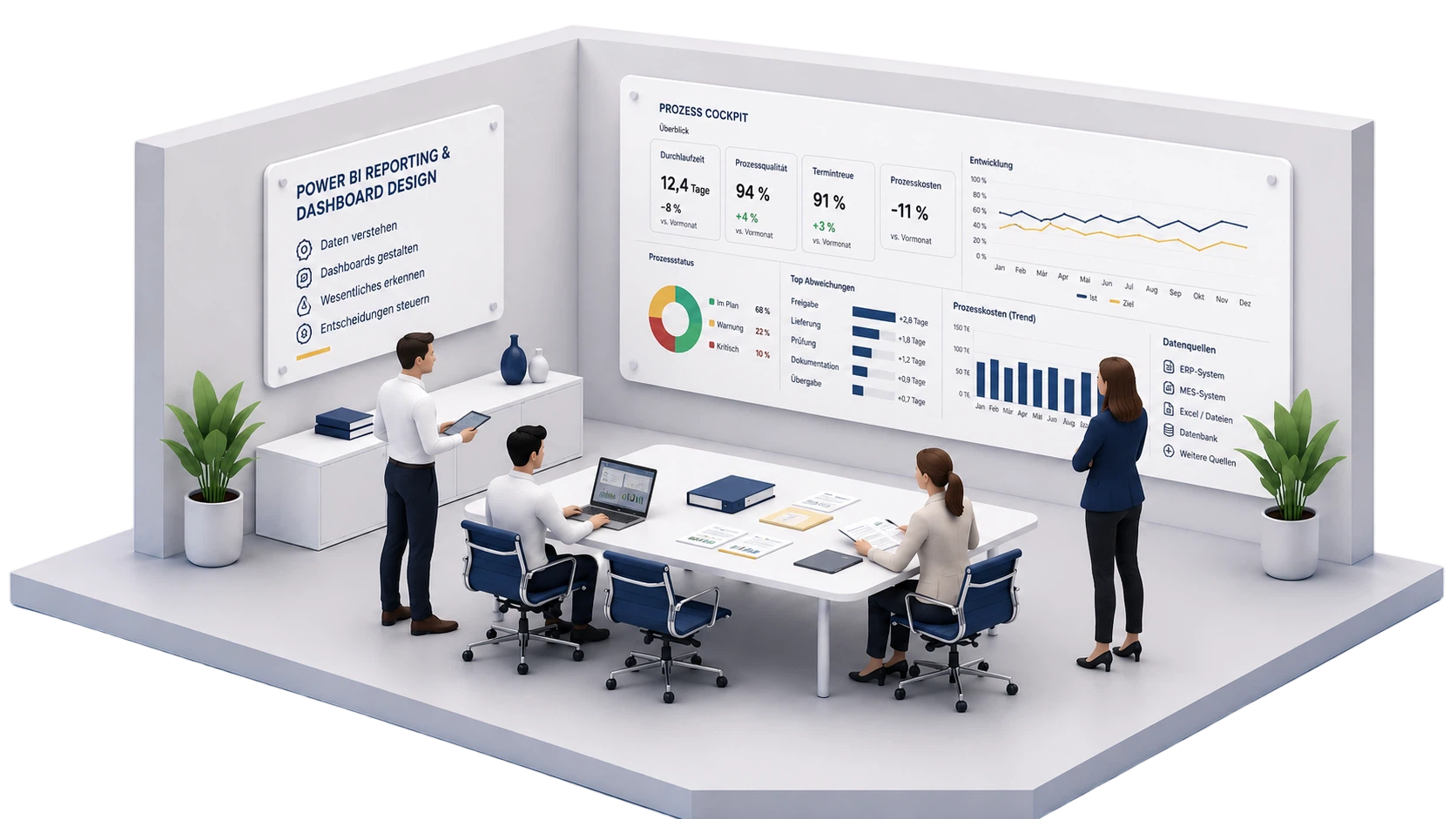
At this point, you need a clear cockpit for your process. A good dashboard bundles relevant information, structures data by areas of responsibility and influence, and shows at a glance at which points action is needed. Through target values, warning ranges and understandable visualisations, developments become visible early, before small deviations turn into bigger problems.
I develop clear Power BI dashboards for your day-to-day work with process data, as well as regular reports for the medium- and long-term development of your process. Understandability, usability and appealing design are central. The presentation is tailored to your requirements, your working environment and the decisions you want to make with the data.